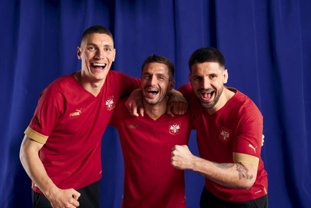
Дуго очекивано Светско првенство у фудбалу 2022. почиње сутра, а сваки од 32 тима који се такмиче у Катару носиће своје националне боје са поносом.

Пре него што се сва акција пресели на фудбалски терен, да погледамо шта ће 32 најбоља тима на свету носити током највећој светској фудбалској позорници.
Када прођете кроз дизајн свих дресова, обавезно гласајте на нашој анкети на дну чланка и гласајте за свог фаворита.
Уколико вам се не учитавају одмах све фотографије, причекајте мало како би видели дресове свих репрезентација са Мундијала.
Група А
Катар – Најк
🇶🇦 QATAR: C+
The World Cup hosts went pretty conservative. Nike hasn’t been great overall. Logos in the center. Cool detail on the sleeves (see flag). Gold, beige and white on away kit are inspired by the coastline of Qatar as well as the tradition of pearl-diving. pic.twitter.com/BtIB4HnH3O
— Nico Cantor (@Nicocantor1) November 14, 2022
Еквадор – Маратон
🇪🇨 ECUADOR: B+@LaTri has always donned bold, bright yellow home kits but the fine details are sick, especially on the away and 3rd kit. It looks like it was inspired by some indigenous patterns and imagery. All white with blue details is also classy. pic.twitter.com/nXDhDrClnp
— Nico Cantor (@Nicocantor1) November 14, 2022
Сенегал – Пума
🇸🇳SENEGAL: B+
Puma has historically killed it with African kits. @Fsfofficielle‘s home kit is no exception. It’s hard to go wrong with such a sick color palette. The star in the middle, the details on the sleeve all over white is clean. Away kit is basic another template though pic.twitter.com/pSCx4QLOFS
— Nico Cantor (@Nicocantor1) November 14, 2022
Холандија – Најк
🇳🇱 NETHERLANDS: C+@OnsOranje‘s orange kits are unmistakable. The dutch decided to play with lighter orange hues on the home jersey which gives it like a fiery look but nothing wowing. The away kit is a common Nike template used for the World Cup. Cool colors, meh kit. pic.twitter.com/slWF146lmK
— Nico Cantor (@Nicocantor1) November 14, 2022
Група Б
Енглеска – Најк
🏴 ENGLAND: B
The @England home kit is quite bland but the away kit is everything but. From boring Nike template with gradiente detail on the home to a vibrant red with tones of two blues on a collar, including a different colored crest. It’s so sick. pic.twitter.com/mhftbpWA4e
— Nico Cantor (@Nicocantor1) November 14, 2022
Иран – Маџид
🇮🇷 IRAN: C+
Finally, Iran unveiled their World Cup kits. @TeamMelliIran has decided to go with something more simple. The print on the sleeves is inspired by the Iranian Leopard native to the Persian plateau. pic.twitter.com/8dJNAlfvK9
— Nico Cantor (@Nicocantor1) November 14, 2022
Сједињене Америчке Државе – Најк
🇺🇸 USA: D@USMNT waited 8 years to be back at a World Cup and THIS is what Nike came up with? The same template makes it look like a training jersey (mirrored Nike logo like on American football jerseys). Nothing truly emblematic on either home or away. O’er say can’t you see… pic.twitter.com/LlNK4r9LUY
— Nico Cantor (@Nicocantor1) November 14, 2022
Велс – Адидас
🏴 WALES: B+
Adidas has unveiled some smooth kits. This one one of them. An electric, red pattern for the home kit with green and white details. The white away with the funky collar like dragon stripes is FIRE. Plus, @Cymru has possibly the best crest at the World Cup. pic.twitter.com/q7N2ypONih
— Nico Cantor (@Nicocantor1) November 14, 2022
Група Ц
Аргентина – Адидас
🇦🇷 ARGENTINA: B@Argentina historically rocks the same style home kit. It’s sweet, the black details on sleeves and stripes are back. Shame shorts aren’t black. Flaming purple (not a national color) on away – representing gender equality, per Adidas AR and AFA. pic.twitter.com/gxHLrlye8a
— Nico Cantor (@Nicocantor1) November 14, 2022
Саудијска Арабија – Најк
🇸🇦 SAUDI ARABIA: B
Home kit for @SaudiNT seems plain but with a closer look you can see one of the national emblems, the Palm Leaf. Nice detail. The green tonal pattern on the away. Falcon on FA’s crest is cool – another national emblem. pic.twitter.com/2MVrHnF07s
— Nico Cantor (@Nicocantor1) November 14, 2022
Мексико – Адидас
🇲🇽 MEXICO: A-@miseleccionmx are back wearing their home green, this one has a pointed, pattern AND a new crest. All colors true to that on the flag. The cream away blows me away with its Aztec design of Quetzalcoatl, the mythical feathered serpent. Top stuff. pic.twitter.com/0ptpw6B4EX
— Nico Cantor (@Nicocantor1) November 14, 2022
Пољска – Најк
🇵🇱 POLAND: C-@LaczyNasPilka‘s primary kit is nothing to write home about. The grey sleeve is inspired by the nest and feathers of the white eagle, Poland’s national animal. Away is also bland, no depth save the sleeve. But clean. Crest saves the kit. pic.twitter.com/wBjd3tjrfk
— Nico Cantor (@Nicocantor1) November 14, 2022
Група Д
Француска – Најк
🇫🇷 FRANCE: A-
The reigning champions’ blue-gold on the home is royal. Plus white shorts, red socks, it’s loyal to La Tricolore. @Equipedefrance‘s away kit, using Toile de Jouy fabric inspired patterns, depicts the Arc of Triumph, the coquerel and images of the French Revolution. pic.twitter.com/mJ0ym7Lsib
— Nico Cantor (@Nicocantor1) November 14, 2022
Аустралија – Најк
🇦🇺 AUSTRALIA: B-
The @Socceroos golden/saffron/buttercup tonal home kit is attractive. The green details combined with the green shorts give it that classic Aussie look. Again, the dark blue away is that same Nike template with vivid teal details. Nothing special. pic.twitter.com/zpRlNdA7ce
— Nico Cantor (@Nicocantor1) November 14, 2022
Данска Хумел
🇩🇰 DENMARK: B
Hummel and @dbulandshold toned down the kits since they „wish not to be visible during a tournament that has cost thousands of people their lives.“ Strong message but they’re still profiting from the WC despite their stance. PR or honest concern? I’m a bit cynical. pic.twitter.com/CZJF2DCqzQ
— Nico Cantor (@Nicocantor1) November 14, 2022
Код дреса Данске смо вам дужни појашњење. Наиме ово је протест, сви брендови, акценти, па чак и грб су исте црвене као и остатак дреса, чинећи те детаље практично невидљивим. Црни дрес је у част радницима мигрантима који су погинули на изградњи стадиона Светског првенства у Катару.
Тунис – Капа
🇹🇳 TUNISIA: A-@FTF_OFFICIELLE wear traditional red and white kits but with a great detail. A historic armor is depicted on the front. It’s linked to an ancient relic claimed by Hannibal, general of Ancient Carthage (modern-day Tunisia).
More info: https://t.co/JlvkpoCdCi pic.twitter.com/60h6JXfUVv
— Nico Cantor (@Nicocantor1) November 14, 2022
Група Е
Шпанија – Адидас
🇪🇸 SPAIN: A-
Quite classy, with raised texture plus a new logo. Classic red for La Roja’s home and a neat trim on the collar. @SEFutbol got funky with the away though. Blue tonal, patterned waves with logos placed centrally. The red, yellow stripes make it pop. pic.twitter.com/3lkAm0wHMR
— Nico Cantor (@Nicocantor1) November 14, 2022
Костарика – Њу Баланс
🇨🇷 COSTA RICA: B
Ever since the @fedefutbolcrc have gone with New Balance they’ve dropped dope kits. This World Cup’s kit’s are clean but a little too simple compared to older tico kits. The details are in the sleeves, but it doesn’t really WOW you. pic.twitter.com/fQ0KOFetXA
— Nico Cantor (@Nicocantor1) November 14, 2022
Немачка – Адидас
🇩🇪 GERMANY: A-
This is some of Adidas’ best work for the World Cup. @DFB_Team_EN‘s kits uses traditional colors but with unique approaches. The thick, black stripe on the home containing logos and numbers is sick. The patterned red and black away is sleek. pic.twitter.com/Y3tSQ3JbbG
— Nico Cantor (@Nicocantor1) November 14, 2022
Јапан – Адидас
🇯🇵 JAPAN: A+@jfa_samuraiblue takes the cake. The origami kits have absolutely smashed it. It’s a pattern with a cultural tie. The white away has got the details on the sleeve. Overall, their entire collection is extraordinarily fashionable. Jackets, warmups, etc. pic.twitter.com/SuYW1tJCTJ
— Nico Cantor (@Nicocantor1) November 14, 2022
Група Ф
Белгија – Адидас
🇧🇪 BELGIUM: A-@BelRedDevils have got some unique kits for the world cup. Check out the flames on the home kits’ sleeves.The away is inspired by the Adidas x Belgian FA x Tomorrowland „LOVE“ capsule collection. Funky colors. Dig it. pic.twitter.com/AEeoixE9Ba
— Nico Cantor (@Nicocantor1) November 14, 2022
Канада – Најк
🇨🇦 CANADA: F
Where do we start with @CanadaSoccerEN? Due to Canada being on a „different development cycle“ Nike just doesn’t have new kits for them for their FIRST WORLD CUP IN FORTY YEARS?! Unacceptable. pic.twitter.com/DGPM8MORrd
— Nico Cantor (@Nicocantor1) November 14, 2022
Мароко – Пума
🇲🇦 MOROCCO: B
Despite Puma not hitting a homerun for this World Cup, this is one of their better attempts. With @FRMFOFFICIEL, the brand respects the nation’s colors in the home kit and gets creative with the away. A cool geometric design in the center where Puma’s put the logos pic.twitter.com/cqI4yrTaua
— Nico Cantor (@Nicocantor1) November 14, 2022
Хрватска – Најк
🇭🇷CROATIA: B+
You know what you’re getting with Croatia: Checkered red and white. @HNS_CFF and Nike got futuristic with the blue away and broke up the sequence with the home. The font for names and numbers? Inspired by the historic Croatian Glagolitic alphabet. pic.twitter.com/d7eid6ikcA
— Nico Cantor (@Nicocantor1) November 14, 2022
Група Г
Бразил – Најк
🇧🇷 BRAZIL: A-@CBF_Futebol dropped dynamic kit. The jaguar pattern on the home jersey, with the modern, classy collar. Peep the detail inside. The pattern of the jaguar – native to the Brazilian rainforest – can be found on the away sleeves, over a green fade. Lightning. pic.twitter.com/lzqPFh05jN
— Nico Cantor (@Nicocantor1) November 14, 2022
Србија – Пума
🇷🇸 SERBIA: B@FSSrbije did a rebrand right before the World Cup that’s led to a minimalist home kit. It’s very regal, with the predominant red plus gold accents. The gold stays on the away – but again – the Puma template doesn’t make it at all impressive. pic.twitter.com/It8RFGIGqk
— Nico Cantor (@Nicocantor1) November 14, 2022
Швајцарска – Пума
🇨🇭SWITZERLAND: C-
It’s not a @nati_sfv_asf thing, it’s a Puma thing. There’s nothing too special about any of these kits. The away kit looks like a the calendar app icon on your phone and the home kit is not that cool. Fan of the flag stamped on there though. pic.twitter.com/aKc0y9Xcl3
— Nico Cantor (@Nicocantor1) November 14, 2022
Камерун – Ол Спортс
🇨🇲 CAMEROON: D@FecafootOfficie has got an underlying issue with Le Coq Sportif. For now, their partnership with One All Sports has produced these three kits, with the same template and changing colors. A shame the Lions Indomptables couldn’t produce better kits. pic.twitter.com/vzJgdrHjWq
— Nico Cantor (@Nicocantor1) November 14, 2022
Група Х
Португал – Најк
🇵🇹 PORTUGAL: C+
To be honest, @selecaoportugal‘s World Cup kits look a bit lazy. There’s so much rich history and culture that you could apply on a jersey and there’s nothing here.
Two colors, split on a diagonal. Then, a split middle stripe behind cream background. Meh. pic.twitter.com/uKlFIiiW2r
— Nico Cantor (@Nicocantor1) November 14, 2022
Гана – Пума
🇬🇭 GHANA: B-
Out of all these Puma templates, @GhanaBlackstars is a salvageable one. I wish that horizontal detail with the black star above the number was the ENTIRE kit. Alas, the away kit is clean. Black star. Nice touch on the fringes. pic.twitter.com/qNorMKt54j
— Nico Cantor (@Nicocantor1) November 14, 2022
Уругвај – Пума
🇺🇾 URUGUAY: B
The home kit for @Uruguay is an homage to tradition. Classic and clean. White sleeve and collar details are bold. White button gives it an old school vibe. Puma logo is gold like 4 world title stars. Away kit? You know what I feel now about iCalendar kits. pic.twitter.com/IMEfZY1NlA
— Nico Cantor (@Nicocantor1) November 14, 2022
Јужна Кореја – Најк
🇰🇷SOUTH KOREA: A-@TheKFA home kit is cool (sick team badge) but nothing to write home about. Cool sleeve details, nice black accents. But THE AWAY KIT OMG. It highlights Taegeuk – the symbol found on the flag – that represents national pride and balance between heaven, earth. pic.twitter.com/7dD6myO4rf
— Nico Cantor (@Nicocantor1) November 14, 2022
То би било то од дресова, а на вама је да гласате!
Zakoni u Kataru: Gde možete popiti pivo, šta ne smete obući i koji su prekršaji za smrtnu kaznu?
Преузмите андроид апликацију.


